
How Gmail Rewrites Your Email Colors in Dark Mode — And How We Reverse-Engineered It
Dark mode has become the default for millions of email users. Over 80% of iOS users have dark mode enabled, and Gmail's Android and iOS apps apply their own color transformations to every email. But here's the problem most email developers don't realize: Gmail doesn't use CSS to switch to dark mode. It rewrites your colors entirely — and no existing preview tool was even close to showing that accurately. We built an engine that gets 75–80% of the way there — closer than anything else on the market.
The Problem: Dark Mode Isn't What You Think
When people hear “dark mode,” they think of @media (prefers-color-scheme: dark) — a CSS media query that lets you define alternate styles. And yes, some email clients respect that. But the biggest client in the world — Gmail — does not.
Gmail on iOS, Android, Chrome, Safari, and Firefox all use a proprietary algorithm to analyze your email's colors and rewrite them for dark mode. White backgrounds become dark. Light text on dark backgrounds gets lightened. But not all colors are treated the same — brand blues, greens, and reds may be preserved, muted, or inverted depending on factors like luminance, saturation, and contrast ratio.
This means that even if you write perfect prefers-color-scheme media queries, Gmail will ignore them and apply its own transforms. The result? Your carefully chosen brand colors might look completely different to the majority of your subscribers.
And the worst part: there was no reliable way to preview this. Every other tool on the market either showed the CSS dark mode version (which Gmail doesn't use) or simply inverted colors with a basic filter — both wildly inaccurate.
Why Every Other Preview Tool Gets This Wrong
Most email preview tools handle dark mode in one of three ways:
- CSS inversion filters — Apply a blanket
filter: invert(1)to the entire email. This flips everything, including images, logos, and brand colors. The result looks nothing like actual Gmail dark mode. - Media query simulation — Trigger
prefers-color-scheme: darkand render whatever alternate styles the developer defined. This works for Apple Mail and some Outlook versions, but Gmail completely ignores media queries. - Screenshot services — Send a real email and capture a screenshot from an actual device. This is accurate but slow (minutes per preview), expensive, and impossible to iterate on quickly during development.
None of these approaches model what Gmail actually does: analyze each color in the HTML, assess its luminance and role (background vs. text vs. border), and selectively transform it according to an internal rule set that varies by client.
What We Did Differently
We spent months studying how Gmail's dark mode actually behaves across every client — Gmail on iOS, Android, Chrome, Safari, and Firefox. We sent hundreds of test emails with carefully chosen color swatches, captured the results, and cataloged exactly how each color was transformed.
What we discovered was surprising: Gmail doesn't use a single algorithm. Each client platform applies slightly different rules. A bright blue that stays untouched on Gmail iOS might get subtly muted on Gmail Android. A near-white background that becomes dark gray on Chrome might become a slightly different shade on Safari.
Using these observations, we built a custom color transformation engine that approximates Gmail's behavior for each client. The engine doesn't use CSS filters or media queries. Instead, it processes the email's HTML at a structural level, identifies every color declaration — backgrounds, text, borders, gradients — and applies transformations modeled after Gmail's behavior.
The result is a preview that gets you 75–80% of the way to what your subscribers actually see — not perfect, but dramatically closer than any CSS filter or media query simulation. And we're continuously refining the engine to push that number higher.
The Hardest Problems We Solved
1. Preserving Brand Colors
One of the biggest challenges was figuring out when Gmail preserves a color versus when it transforms it. If you use a vibrant brand blue (#4a9eff) as a button background, Gmail keeps it. But if you use a muted grayish-blue, Gmail might darken it into something unrecognizable.
Our engine had to learn the threshold between “vibrant enough to keep” and “too neutral, so transform.” Getting this wrong meant either preserving colors that Gmail actually changes (false positive) or transforming colors that Gmail actually keeps (false negative). Both destroy preview accuracy.
2. Maintaining Visual Hierarchy
In light mode, email designers use subtle shade differences to create depth — a white card on a slightly off-white page background, for example. When Gmail converts these to dark mode, the hierarchy must be preserved: the card should still appear “lighter” than the page, even though both are now dark.
Early versions of our engine sometimes inverted this hierarchy — making the card background darker than the page background. We had to develop a mapping that preserves the relative luminance relationship, not just the absolute values.
3. Client-Specific Variations
Gmail on iOS WebKit doesn't transform colors the same way as Gmail on Android's WebView or Gmail on desktop Chrome. We had to build separate transform profiles for each client and test continuously against real devices to keep them calibrated.
This is why MailViewr lets you switch between “Gmail iOS,” “Gmail Android,” “Gmail Chrome,” and other clients — each one runs a different transform pipeline, because that's what happens in reality.
4. Inline Styles vs. Embedded CSS
Gmail strips <style> blocks in some contexts and preserves them in others. Colors can come from inline style attributes, embedded stylesheets, or even HTML attributes like bgcolor. Our engine had to handle all of these sources and transform them consistently, regardless of where the color was declared.
What This Means for Email Developers
With MailViewr's dark mode engine, you can now:
- Get a close preview of Gmail dark mode — 75–80% accurate color transforms that show you the general direction Gmail takes on each platform.
- Test across every Gmail client — iOS, Android, Chrome, Safari, and Firefox, each with their own rendering behavior.
- Iterate in real time — Change a color in the editor and see the dark mode result instantly. No sending test emails, no waiting for screenshots.
- Catch issues before your subscribers do — Brand colors that get washed out, text that becomes unreadable, backgrounds that merge together. All visible in the preview.
Is it a perfect 1:1 match? Not yet — Gmail's algorithm is proprietary and complex, especially for edge cases like dark backgrounds and context-dependent text colors. But at 75–80% accuracy, it's the closest any preview tool has come, and it's instant and free. We're actively refining the remaining 20–25%.
Where We Match — and Where We're Still Improving
Our engine handles the majority of color scenarios accurately. Here's an honest look at where we nail it and where we're still refining:
| Scenario | Other Tools | MailViewr | Actual Gmail iOS |
|---|---|---|---|
| White background | Black (inverted) | Dark gray (#262626) | Dark gray ✓ Match |
| Brand blue (#4a9eff) | Orange (inverted) | Preserved (#4a9eff) | Preserved ✓ Match |
| Green CTA (#22c55e) | Magenta (inverted) | Preserved (#22c55e) | Preserved ✓ Match |
| Red alert (#ef4444) | Cyan (inverted) | Preserved (#ef4444) | Preserved ✓ Match |
| Off-white page (#f4f4f7) | Near-black (inverted) | Slightly lighter dark | Slightly lighter dark ✓ Match |
| Dark navy bg (#0d1b2e) | Bright white (inverted) | Kept dark | Lightened to lavender ✗ Improving |
| White text on dark bg | Black text (inverted) | Kept white | Darkened for contrast ✗ Improving |
Light backgrounds, mid-tones, and saturated brand colors — our engine gets these right. The remaining gaps are in how Gmail handles already-dark backgrounds and the text colors that depend on them. Gmail's behavior here is context-dependent and less predictable, and we're actively working to close the gap.
See It for Yourself: MailViewr vs. Actual Gmail iOS
Numbers and tables are useful, but nothing beats a side-by-side comparison. Below are real screenshots — our MailViewr preview on the left, and the actual Gmail iOS app (dark mode) on the right. Same email, same content, same dark mode toggle.
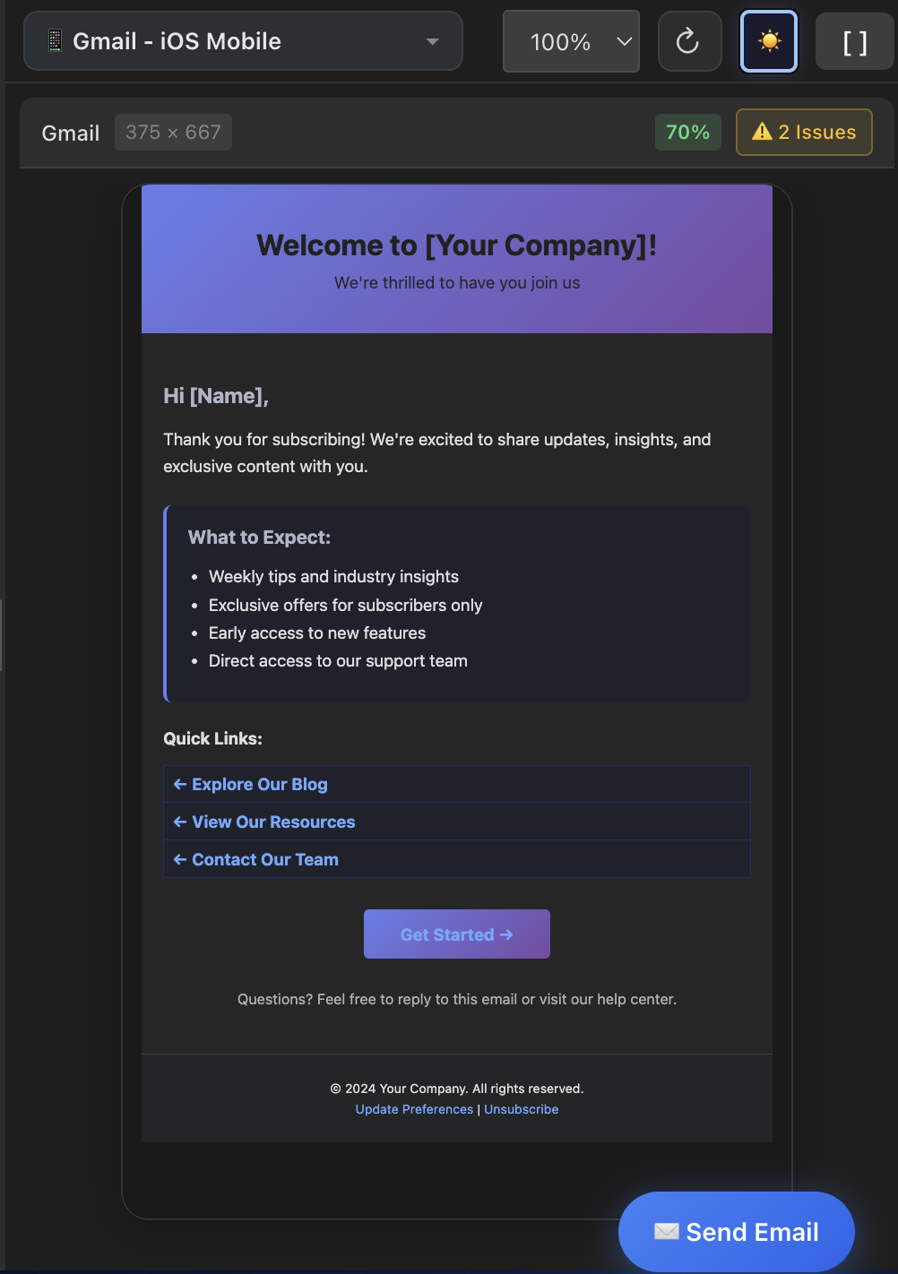
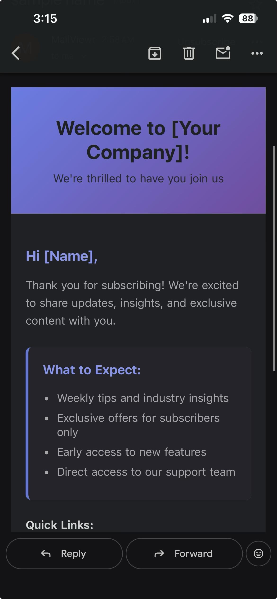
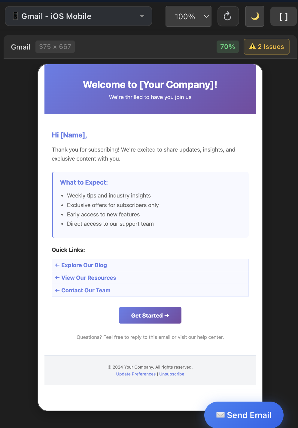
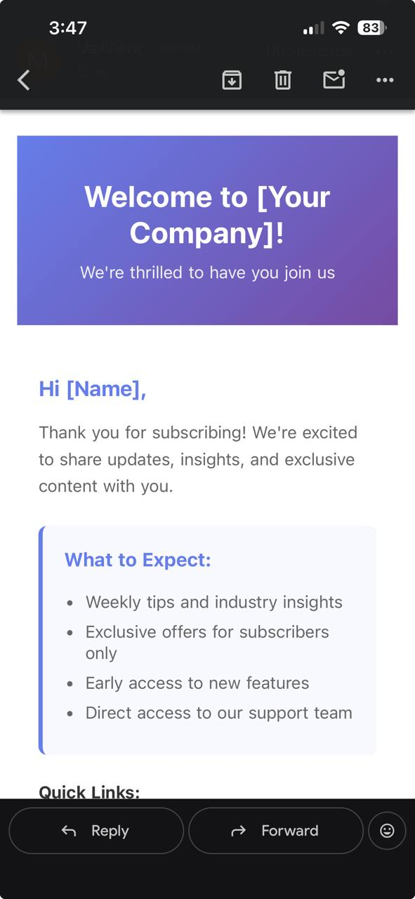
Example 1: Welcome Email Template
This welcome email uses a purple-to-blue gradient header, a dark card body, and accent link colors. Notice how MailViewr's preview closely matches the actual Gmail rendering — the gradient is preserved, the dark background tones align, and the text contrast is consistent.
MailViewr Preview
Actual Gmail iOS
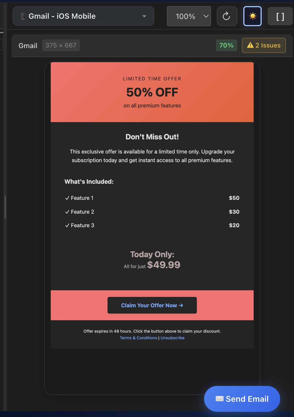
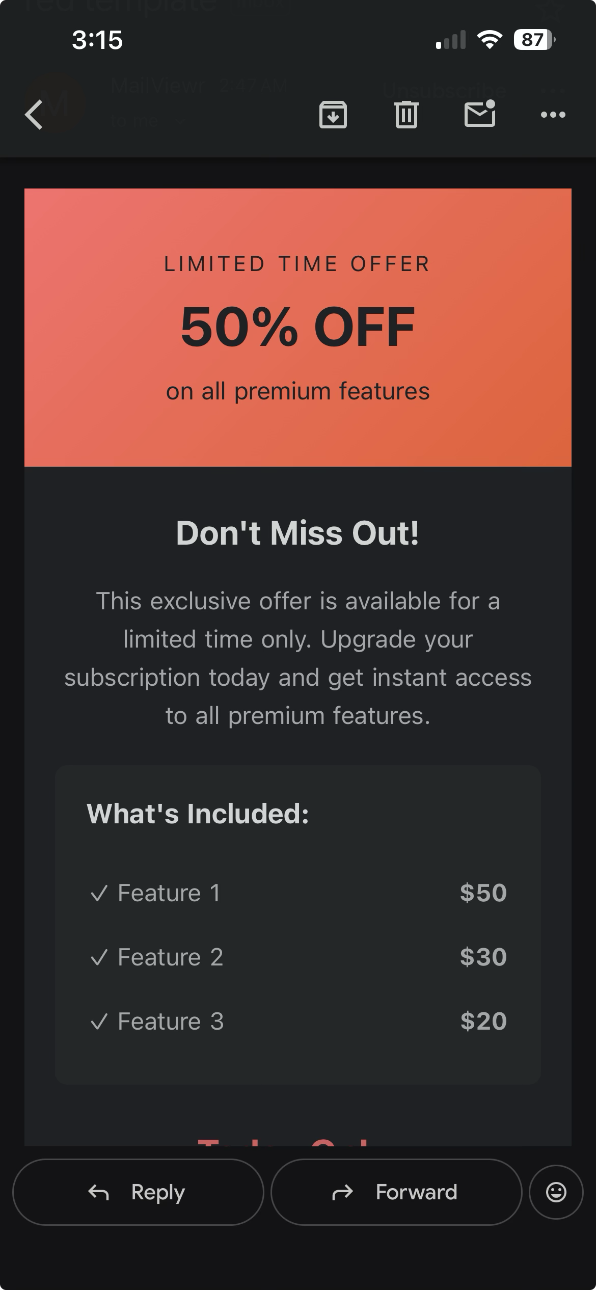
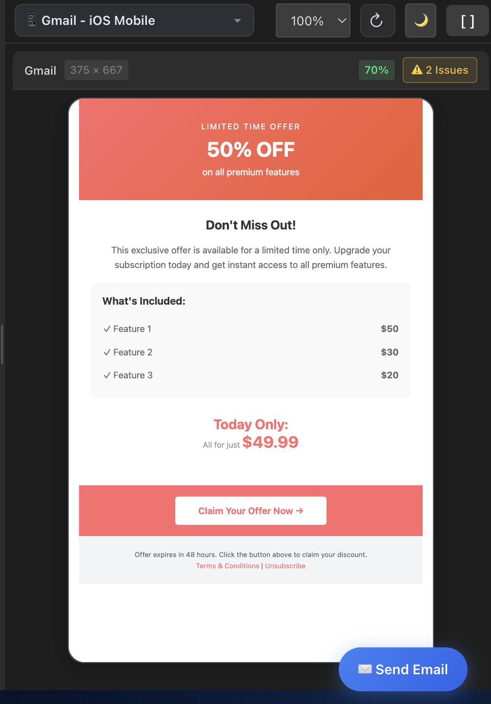
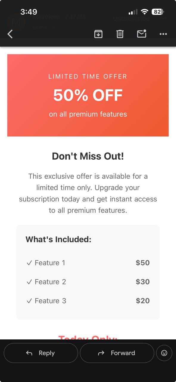
Example 2: Promotional Email Template
This promotional email features a warm coral/orange gradient banner, a dark content area with pricing tables, and a prominent CTA button. The preserved gradient tones, dark background treatment, and text color transformations all align closely between preview and device.
MailViewr Preview
Actual Gmail iOS
These comparisons demonstrate roughly 75-80% color accuracy— the overall tone, contrast relationships, and visual hierarchy are preserved. The remaining differences come from Gmail's proprietary fine-tuning: subtle shifts in text lightness, minor border color variations, and platform-specific rendering quirks that differ even between Gmail iOS versions. We're continuously testing against real devices to push this accuracy higher.
Light Mode Is Accurate Too
Dark mode gets the headlines, but light mode accuracy matters just as much — it's still how the majority of emails are viewed. MailViewr's light mode preview matches the actual Gmail iOS rendering almost exactly: same colors, same layout, same visual feel. Here's the proof.
Welcome Email — Light Mode
MailViewr Preview
Actual Gmail iOS
Promotional Email — Light Mode
MailViewr Preview
Actual Gmail iOS
The light mode comparisons are near-identical — colors, spacing, and hierarchy all match what Gmail iOS renders. This confirms that MailViewr's rendering engine is accurate as a baseline, meaning the dark mode transforms you see above are additive improvements on top of an already-faithful preview.
Why This Is a Breakthrough for the Industry
Dark mode email rendering has been a black box since Gmail introduced it. Email developers have been flying blind — writing code, sending test emails, checking on physical devices, and hoping for the best. The lack of accurate preview tooling meant that dark mode bugs were discovered by subscribers, not developers.
By reverse-engineering Gmail's color transformation behavior across every client, we've turned that black box into a transparent, instant preview.
If you're building HTML emails and care about dark mode accuracy, we invite you to try MailViewr and see the difference for yourself. Paste your email HTML, toggle dark mode, and finally see what your subscribers actually see.